Friday, January 29, 2010

BB Couture - Hands of Hope Collection Swatches

As promised, here are the swatches of the Hands of Hope Collection from BB Couture for nails. The collection consists of 6 shades all with names of places in Haiti. As I mentioned before, 25% of the sales from this collection is donated to the Salvation Army to aide the women and children affected by the earthquakes in Haiti.

Tortuga Island, Kyona Beach, Bassins Bleu

Paradise, Labadie Beach, Cap-Haïtien

Tortuga Island - Tortuga is an island off the northern coast of Haiti. Its name in Spanish (Isla Tortuga) and French means "Turtle Island" or "Tortoise Island". Tortuga Island the polish, is a pale, yellow-green with a lot of silver shimmer that gives it a bit of a frosty look. It reminds me of key lime pie. This swatch is three coats, as I thought the finish was a bit too thin with 2 coats. This is not a bad color, but it's not one of my favorites.

Kyona Beach - Kyona Beach is a gorgeous little beach on the western coast a little north of Port-au-Prince. Kyona Beach the polish is a very pretty robin's egg blue creme. I am calling it a creme but it does have a little hidden shimmer in it, but it is very hidden. This gave me a really bad application the first time I tried to swatch it. It was very uneven, even with Seche Vite. I don't know if it was the lack of a base coat or that it was too thick, but the next time I swatched it I did use a base coat, and I thinned it a bit and that make everything okay. The swatch is 2 coats.

Bassins Bleu - The Bassin Bleu in Haiti consists of a series of natural rock bassins arranged in cascade, successively pouring water into one another. That sounds amazing! Apparently Bassin Bleu is restricted to a minimal amount of tourists per day to preserve its environmental integrity. Bassins Bleu the polish is a blue sided, shamrock green creme. It looks to me like it has itty bitty black particles in it, but they are very sparse so I don’t know if it is contamination or intentional. Regardless, I like the color and application was great. This swatch is 2 coats.

Paradise – This is so awesome! When I first saw the pics for this collection, Paradise looked like a peach creme. It’s definitely not a peach creme. This is the color of putty. It is beautiful. I wore this for a few days and got many, many compliments on it. In some lights it looks like a pale mauve-purple from just a hint, to very mauve-purple. It’s awesome. In the swatch you can see that there is a lot of golden shimmer, which I am sure we can attribute with making this shade look peach, but it really doesn’t translate to the nail. This is my favorite of the bunch and this swatch is 2 coats.

Labadie Beach - Labadie is a strip of land on the secluded Pointe Honore near Cape Haïtien, Haiti. This beach is one of the world's best sandy beaches and it is protected by coral reefs. Labadie Beach the polish is a cool, medium pink with purple shimmer. Very pretty and has great application. This swatch is 2 coats.

Cap-Haïtien – Cap-Haïtien, Haiti is a city on the northern coast of the country. Cap-Haïtien the polish is a really awesome medium purple. I think it is much better in real life than in the swatch. In real life it is a bit darker/more saturated and just prettier, but in a way that I can’t seem to find words for. This is very stunning and not like any other purple I have. This is my 2nd favorite from the collection. It has a small amount of very fine red shimmer, but sadly it is pretty invisible on the nail. This was a dream to apply. I probably could have gotten away with one coat. This swatch is two coats.


The entire collection retails for $54, or $9 per bottle. If you can’t spring for all of them right now, it is okay. You can purchase them individually and still 25% of the sales will go to help the earthquake victims in Haiti. They can be purchased at Overall Beauty.com

Models Own Sale Now On

Just a little PSA for you:

Models Own sale Now On

Get 50% off all orders over £20 for 72 hours only – while stocks last.

Enter promo code: FIFTYFIFTY at the checkout for 50% off.

Visit http://www.modelsownit.com

I don't have any Models Own to share with you guys, but I thought I would pass this along. They do ship internationally!

Be back later with a "real" post.

-Elaine

Thursday, January 28, 2010

Maybelline - Sunset Prisms

Happy Thursday Everyone! I am back in the city! I had to go a couple hours away to farm county, Illinois for work. But I am back today and it is !@#$% freezing! It was -10 this morning with the windchill! That is wildly unnecessary. Freezing temperatures I can take. Sub-zero arctic blast... that is a bit excessive.

Today's NOTD is a shade I picked up at a drugstore downstate yesterday. Yes I am that much of an addict I had to hunt for polish on a work trip! It is Maybelline - Sunset Prisms. At least that is what the bottle says. I don't believe it.

See, I have seen Sunset Prisms dozens of times. It is part of the core Maybelline display in drugstores and Ulta. Have you seen it? I look at it a lot and contemplate buying it but always decide against it because it looks just like one of my favorite colors: Color Club - Tangerine Scream. It's a bright orange with a green flashy, shimmer. Why intentionally buy a dupe? Well, this time I bought it. Because it is not an orange with a green flash. It is a bright pink with a very strong gold flash. Not the same. But the label still says "Sunset Prisms". I was baffled. I had to buy this oddity. There were even other bottles behind this odd bottle that were the "real" Sunset Prisms, and had the same label. So I thought this guy I bought must be from an off batch, or is really old before a color change, or it's a new color change, or it has the wrong label. I didn't know, but I liked it! But when I searched for swatches, all the swatches are of the pink with gold shimmer. So maybe all the bottles of orange with green shimmer are the weirdos! Now I have to go buy it too, don't I? Crap. Fine Maybelline, you win. I will buy the other Sunset Prisms and do a comparison for everyone. Happy?

In any rate, this version of Sunset Prisms is very pretty. I did three coats, it is very flashy and shimmery; even in low lights. I am very happy with it! It looks like a cousin to the Zoya - Reverie Collection.

When I get my hands on the other version I'll show them to you side by side.

Have a great day!
-Elaine

Wednesday, January 27, 2010

I'm-Not-Really-Here Green SPAM

Hi everybody! I am on the road for work today so I have a fun, easy post: GREEN SPAM! Enjoy!

Amour - Ellis Green

Maybelline - Lime Aluminum

BB Couture - Laguna Lagoon

Sally Hansen - Make-a-Mint Frost

Barry M - Spring Green

Essence - All Access

Tuesday, January 26, 2010

Comparison: China Glaze - Four Leaf Clover vs. Color Club - Wild Child


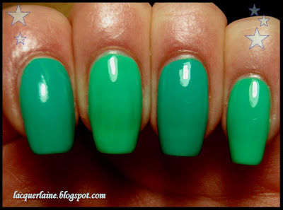
Hello everyone! I have a quickie comparison for you all today. When looking at the new Up & Away colors from China Glaze, I was wondering how Four Leaf Clover compared to Color Club's Wild Child. I assume others would like to know too, so I made a comparison swatch. They are both mega-bright, borderline neon, shamrock greens, but very different.

Index and ring: Four Leaf Clover
Middle and Pinky: Wild Child

Note: The colors are probably just as bright as the swatch depicts, but they are a bit more saturated in color.

Wild Child is much lighter than Four Leaf Clover. Wild Child is also more of a jelly consistency and is thin and needed 3 coats. Four Leaf Clover is very opaque and creamy and needed two coats.

So, my personal opinion is that the shades are different enough to own both, but if I had to pick one, it would be Four Leaf Clover.

What do you think?

Monday, January 25, 2010

A Very Merry Un-Birthday


Here is a little something I rocked over the weekend. I started with a base of NYX - Dancing Queen, then I did a glitter gradient of OPI - Mad As A Hatter and a gradient of Lippmann Collection - Happy Birthday. I call it "A Very Merry Un-Birthday"!

The gradient wasn't very difficult to do. I started at the base, and with less polish on the brush than I would need for the whole nail, I made a couple of swipes only on the bottom third of the nail. Then I pushed a little bit toward the tip to get those few loose looking pieces. I did this with both glitters. Once the glitter was where I wanted it, I added a top coat and viola!

NYX - Dancing Queen, OPI - Mad As A Hatter, Lippmann Collection - Happy Birthday

Have a great Monday!
-Elaine

Sunday, January 24, 2010

The Best Nail Tip Ever: Glitter Removal Made Easy. VERY EASY

In light of all the super dense glitter we have gotten recently, i.e. Nubar - Sparkles, Zoya - Ultra Glitter, OPI - Alice in Wonderland, I thought it was about time to post this tip for removing glitter. Some of you may be reluctant to wear glitter polish because you know what a headache it is to remove them. Well forget all that! You can rock the bling, and get it off in a snap. Sound too goo to be true? IT ISN'T!

This is the *BEST* tip I have ever gotten related to nails. It feels like you are a magician.

Necessary equipment:
  • aluminum foil
  • cotton balls
  • nail polish remover: acetone or non-acetone*
  • a clock/stopwatch
  • 10 nails full of glitter!
Step 1: Start out with a rock hard glitter mani. I chose to use my Mad As A Hatter mani for this tutorial when it came time to take it off. Get yourself 10 cotton balls, and 10 pieces of tin foil cut into little rectangles. They should be about 3 inches on each side, roughly.

Step 2: Take a cotton ball and soak it in remover. it doesn't have to be sopping wet. Just get as much as you would for usual removal. Place it on your nail.

Step 3: Take a piece of foil and wrap it around your finger tip in order to keep the cotton ball in place.

Repeat Step 2 and Step 3 for the remaining nails on that hand. I say this because I think it is easier to do one hand first and take them all off before doing the next. It you try to do the second hand with foil fingers, it's a bit tricky.


Step 4: Wait for 5 minutes. 5 is the magic number. I tried this with all different times. 1-3 minutes was not enough, 4 almost made it, but 5 for sure, was when things came right off.
*This is where the asterisk come in. I tried the foil method with non-acetone remover and it worked just fine, however I didn't test it for 5 minutes. It was probably on for 7ish minutes. It may have been just fine at 5, but I don't know for sure.

Step 5: Using a little pressure on the nail, pull the whole foil/cotton ball combo off in one swoop.

Step 6: Marvel at out clean your nail is! There is still some blue on the tip as you can see, but all the glitter is gone! Check it out:

It is all in the cotton ball!

Step 7: Repeat to the other hand.

So just to really drive the message home: this manicure was on for several days and it consisted of a base coat, 2 coats of Sally Hansen - Thinking Of Blue, 1 coat of Seche Vite, 2 coats of Mad As A Hatter, and yet another coat of Seche Vite. Seven coats including 2 of a super dense glitter, and this got it all off in. one. swoop. This is not a joke, ladies!! Try the foil method. It will change your life.

I hope this was helpful and will inspire you to wear more glitter polishes!
-Elaine

Saturday, January 23, 2010

Yellow creme comparison featuring Up & Away

Hello all! It seems I have several yellow polishes! I thought it would be nice/helpful to do some comparisons of them. There are several other brands "featured" in this post, but I mention China Glaze Up & Away colors because they were the ones I was waiting for to do the comparisons. Also, there was a great discovery made about both the Up & Away yellows once I did the comparisons. First up is the banana yellows:

Rescue Beauty Lounge - Squarepants, Sally Hansen - Yellow Kitty, China Glaze - Lemon Fizz, BB Couture - Little Deuce Coupe

From left to right:
Squarepants - 4 coats
Yellow Kitty - 3 coats
Lemon Fizz - 2 coats
BB Couture - 2 coats

Squarepants is of course a jelly, and Yellow Kitty falls somewhere in between jelly and creme. Lemon Fizz is very creamy and opaque and applied like a dream, and Little Deuce Coupe is right behind. Lemon Fizz is clearly the brightest.

Next up is the sunshine yellows. This comparison was inspired by SalvagedExpression who asked about a comparison about over a month ago! Here it is girl!

Sally Hansen - Lightening, China Glaze - Happy Go Lucky, Diamond Cosmetics - Lemon Yellow Zest, OPI - The "It" Color

From Left to right:
Lightening
Happy Go Lucky
Lemon Yellow Zest
The "It" Color

All were 3 coats with the exception of The "It" Color at four. Happy Go Lucky was super close to being 2 coats. I was really rooting for it. It looked pretty good at 2, but I had to do three for the pic because it did have a slight streak to it. Too bad. I really wanted to report that it was a 2 coater like Lemon Fizz. Anyway, yet again, China Glaze is the brightest, Lightening is right behind, and Lemon Yellow Zest and The "It" Color step down respectively to darker/more orange.

So the discovery I spoke of was just that both of the China Glaze yellows were the brightest against their competitors. Also, they had phenomenal application. Lemon Fizz is an incredible 2 coater, and I think you could get Happy Go Lucky on in 2. It has the potential, I just missed it and had to go for 3.

This Up & Away Collection is really knocking my socks off!

Friday, January 22, 2010

Relapse

As of late I have been liking blue polish more. I think aside from colors like sheers and nudes, blue was lowest on the totem pole. Maybe brown and black were lower, but my feelings for blue were very odd because there were of course blues I loved and wore, but a lot of times blues that other people were drooling over, I was not, or when I bought blues I never wore them. Well for whatever reason that tendency is shifting. Out of all the Sally Hansen - Complete Salon Manicure colors I showed you, Thinking of Blue was the one that I wore first. And I didn't want to take it off!

The whole reason I say all this is because of a new lemming I found in myself for a discontinued blue: Lippmann Collection - Rehab. I saw it plenty and didn't want it, but for some reason lately I wanted it. I can't get it, so I made my own! I named it Relapse.

I used mostly clear, and equal amounts of both Wet n Wild - Nocturnal and China glaze - Liquid Leather. If I had to give measurements, I would say 4 parts clear, 1 part Nocturnal and 1 part Liquid Leather.

It is very translucent and needs 4 coats but that is what I wanted. i didn't want it too pigmented and looking like a nearly black creme. I wanted it to be obviously blue and obviously jelly. Check it out! >>>

Have a lovely weekend!

Thursday, January 21, 2010

Rescue Beauty Lounge Surfer Girl - Spring 2010

360, Bangin', Diddy Mow

Mornin' lovelies! How are we!? Today I am bringing you some yummy swatches of Rescue Beauty Lounge's upcoming Spring Collection. It is called the Surfer Girl Collection and the inspiration for Ji Baek was Proenza Schouler's surfer-influenced Spring 2010 RTW Collection.

Ji Baek: What I loved about the show was the cool, breezy attitude of the models and the clothes. There was a sense that they'd just put down their surfboards and slipped on their runway dresses, with minimal makeup and salt-styled beach hair.

Quotes like that make me love these colors a bit more. They evoke this feeling of the beach and I don't love my hair more than when it is naturally tousled and textured with salt water. I even brought home a big bottle of the Pacific with me from California when I went there in 2006 so I could spray it on my hair!


360 - This is a grayed blue; slate blue, if you will. I am going to call it a creme, but it has a smidgen of silver shimmer in it. It gets its name from a move where the surfer and board spin 360 degrees on the face of a wave. I found this color very flattering against my warm/reddish skin and also very calming and serene. This is very beautiful.

Bangin' - I love the name of this polish. I said in the summer when I posted LA Girl Rockstar colors that "Head Banging" should have been "Head Bangin' ", but what do I know?! Anyway, this is a bright and very bold red creme with a bit of orange/coral tinge to it. I think this color would flatter most and would look incredible with any outfit. At first it reminded me of Sally Hansen - Caribbean Coral, but Bangin' isn't as obnoxiously bright as that one.

Diddy Mow - This is my favorite of the collection. Apparently "diddy mow" is a surf term for a harsh wipe out. Ji Baek describes this as, "the color of sand through sea water, the moment before you eat it!" That is quite the awesome description! This is a greenish-gray and I adore it. I adore it for it's uniqueness and for the way I can't stop looking at it! I am wearing it right now and I keep looking at my nails instead of typing! It has a very slight, hidden shimmer but even less than 360. It actually appears to me, and maybe it's just the topcoat, that it has this all over very slight, shimmery sheen. It's not really like a shimmer, but like my topcoat is cloudy. Maybe that is all it is. HAHA! This color, although having nothing to do with surfing, reminds me of my dad. I think because I am picturing a jacket he has that is the same color. Inspiration can be found in our fathers' closets I guess!

I am not really supposed to comment on the formula since the press release says all press samples are not RBL's formula, only used as color reference. But these were smooth as usual and nearly perfect in one coat. All swatches are two coats.

The Surfer Girl Collection can be found on Rescue Beauty Nail Polish and will be available sometime in March or April 2010.

What do you think? :c)

Disclosure: The products featured in this post were furnished to me by the manufacturer or PR company for review. For more information please visit my disclosure policy.

Wednesday, January 20, 2010

Thinking of a Mad Blue Hatter

OPI - Mad As A Hatter

Morning all! I am bringing you a mani I wore over the weekend that I was madly in love with. I called it "Thinking of a Mad Blue Hatter". It is a halfmoon mani with Sally Hansen - Thinking of Blue and OPI - Mad As A Hatter from the new Alice in Wonderland collection. When MAAH came in the mail on Friday I was dying to wear it but wasn't ready to part with my Thinking of Blue mani, so I put them together:


I used reenforcement stickers cut in half to protect the bottom part of my blue mani and painted the rest with Mad As A Hatter. I did two coats of MAAH, pulled off the stickers, and did a coat of Seche Vite top coat over the whole nail.

close-up of glitter *Drool*

Have a great day!
-Elaine